Sunday, January 12, 2014

Pointe in Perspective

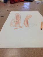
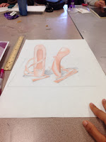
For my perspective project, I wanted to do an anamorphosis drawing. Since I used to do ballet, I decided to draw pointe shoes and make it seem as if they were standing up. To do this project, I first drew out the shoes with the correct proportions and opened it up in Photoshop. There, I adjusted the proportions so that if I were to look at the shoes from a certain angle, the shoes would look 3D. After that I drew the shoes and colored it with colored pencil. Finally, I drew the shadows and cut out part of the background in order to create the 3D effect.
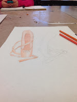
The toughest part of this project was determining the correct proportions of the shoe. I had to keep adjusting them until I could make it seem as if the shoes were standing up. I also tried to use certain techniques to color in the shoes to create a more realistic look.
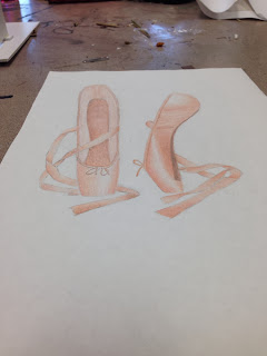
I think that the project as a whole was a big risk for me. This is because I had never done an anamorphosis drawing before, and the one I wanted to do was very complicated. However, after much trial and error, I was able to get all of the proportions right in the end.


Wednesday, January 8, 2014

Layers of Art Supplies

I really wanted to do one project where the theme itself would be art. I chose to do this for my layering project. I thought it would be interesting if I could make it so I had layers of art supplies on top of each other.

To do this project, I first cut out 3 identical rectangles out of a foam board. I used acrylic paint to paint art supplies on each layer of the foam board. Then, I cut out the middle of the top two pieces with an exact-o-knife. Next, I cut out squares to add to the corners of the board so there would be some depth between each layer. I then added a border with black paper around the edges in order to keep the 3 pieces together. Finally, Mr.Sands suggested that I put plastic over the artwork to make it more interesting. I really liked this idea.

I chose acrylic paint because it was bold and easy to use. I chose to put them on foam boards because it was sturdy yet possible to cut open in the middle. There is no difference in value between all 3 layers. Each layer is equal in importance and simply add to the overall layering effect. I did, however, put the larger items on the bottom and the smaller art supplies (such as a pencil) on the top.

The biggest issue that I faced while working on this project is cutting out the pencils and paintbrushes in the top layer. This is because I had to be very careful not to cut the actual pencil/paintbrush. I also found that it was difficult to cut the foam board in general because of the thickness of the board.


This project was a risk because the idea itself was very different and not simply a painting or drawing. I improvised along the way and had to paint several details, such as when I was painting the oil pastels. As I mentioned before, cutting around the art tools was also a risk.


I used certain techniques to paint the supplies. I tried to use bold colors and very neat lines so that the art supplies would look realistic. "Concept" was another characteristic of my artwork. The mix of paint, foam boards, plastic, and improvisation led me to create a unique piece of art. Despite minor mistakes and errors, I was very happy with how the project turned out in the end.


Wednesday, November 20, 2013

Time as an Element: Road to the Future

For the 'Time as an Element' project, my first idea was to choose a room in the house and demonstrate how the room has changed over the years (for example: comparing a kitchen in the 1800's to now). However, the project was a little too difficult, and I could not find proper examples of the room in the time periods that I wanted to use. I then came across another idea, which is the one that I went with. I wanted to draw a road with buildings on either side that would range from old to new as you traveled across the road. The buildings at the beginning would be old, and therefore black and white. As you moved forward, the black and white would gradually change to color, and the buildings would become more modern. I also wanted to add cars on the road that would gradually become newer as you moved along the road.


 After planning out the drawing, I began the final product by drawing out all the buildings, the road, and the cars. I then started coloring the drawing with colored pencils. I am a fan of colored pencils, and I really wanted to use Prismacolor colored pencils (which I had never used before), so I decided to use them as my medium.


The technique that I used was to color in a small circular motion. The reason I did this was that it would give the drawing a uniform and smoother look.


I did not take too many risks in this project, but I did have some difficulties along the way. For example, I had to make sure that all the buildings, the road, and the cars were in the right perspective. The buildings and road were not much of a problem, but the cars were quite tough to draw in the correct perspective. I ended up taking a picture of a toy car to use as an example.


I think that the main characteristics of art that I used are technique, concept, and medium. Colored pencils were my medium, the circular motion used to color in the drawing was technique, and the concept was going from the past to the future. Overall, the project took a while to complete, but I was mostly satisfied with the end result.


Thursday, October 3, 2013

Intertextuality Project - "Twilight" to "Ilight"


My first idea for the intertextuality project was the one that I went along with. The idea was to change the cover of the book "Twilight". In the actual cover, there are two hands holding an apple. I wanted to change it so that the hands would hold an iPhone, from the company "Apple".


 In order to make the final product look very realistic and exactly like a book cover, I decided that my medium would be computer art. First, I took a picture of another person's hands holding an iPhone. I used a spotlight in a dark room in order to get a good light effect. I uploaded the picture on to Photoshop, where I darkened the background and added some effect in order to match the original cover. I changed the title from 'Twilight' to 'Ilight' because all of the products in the Apple company begin with 'I'. I also changed the author's name to Steve Jobs because he founded Apple. I also extended the new cover outward in order to match the dimensions of an actual book cover. Finally, I designed the side of the book, printed it out, folded it accordingly, and put it around an actual Twilight book.


 I took a risk in this project by using computer art to make my final product. The reason this was a risk was because I was not very familiar with this medium. However, I was able to learn a lot about the different tools on Photoshop from doing this project.

Thursday, September 12, 2013

Text Project


For my text project, I wanted to pick a topic, such as clothes, food, or art, that is diverse among different cultures. I decided to use fashion as my topic because it is interesting to see how unique and different each culture's clothing is. I chose to use acrylic paint on a canvas to do this project, because I am familiar with how to use it, and acrylic paint is very bold and stands out. In order to incorporate text, I drew very large price tags and connected them to each attire, and I wrote the country that the clothing belonged to on top of the price tag in the country's main language. I did not take many risks with this project, but I was a little unsure about how the spacing of the clothes would look in the end. However, I am satisfied with the placement of all the clothes and price tags in the final product. I believe that this project greatly conveys how diverse cultures are across the world, especially in fashion and languages.